

Update July 2014: a newer dataset is available that includes 44 dissertations (here is the gephi file), and the final paper is now published: Rettberg, Jill Walker. 2014. “Visualising Networks of Electronic Literature: Dissertations and the Creative Works They Cite.” ebr: electronic book review, July 2014.
We’ve been doing a lot of work lately using Gephi to visualise connections between authors, creative works, critical writing and events in the ELMCIP Electronic Literature Base. It’s pretty easy to get started, and here’s a writeup of the quick tutorial we gave participants in our Visualising Electronic Literature workshop last week.
First of all you’ll need to download and install Gephi, which is open source and available for Mac OS X, Linux and Windows. Then download this ready-made .gephi file which contains information about 32 PhD dissertations on electronic literature and the creative works they reference. To make that file I entered information about the dissertations and links to the creative works they reference in the ELMCIP Electronic Literature Knowledge Base and then exported that information and imported it into Gephi. Here’s the list of dissertations and you can follow the links yourself. I’ll explain how to do the export and import in a separate tutorial next week, so that you can create your own electronic literature datasets to visualise.

When you open the .gephi file you’ll see a tangle of nodes in the middle (Figure 1). There are three tabs at the top. This one is the overview, which is where you can set up your visualisation. The middle top tab lets you see the Data Laboratory, where you can view all your data as a spreadsheet – which is what it really is. This is useful for sorting or seeing what nodes are actually in there, and for things like ranking the nodes according to how many references they have pointing to them. The third tab opens the Preview window which is where you make your visualisation pretty and export it as an image or PDF file.
Basic navigation
You zoom in and out using a scroll bar on a mouse or moving two fingers up and down on a touchpad. You can move the whole network around by right-click-and-dragging (cmd + click the mouse to drag on a Mac).
You can turn on labels by clicking the T icon at the bottom, but this gets pretty hard to read. You can adjust the size of the labels by using the controls at the bottom (hint: if you click that tiny upwards arrow on the bottom right you get more controls:


You can also use the arrow with a question mark on the left of the graph window  to select a node and see information about it in the upper left of the workspace. The little hand icon
  lets you move individual nodes – which if you want to analyse this as a network you should only do to make the graph more legible, for instance to be abel to read the labels clearly.
You may like to switch between the Overview and the Preview views often. You do that right at the top of the workspace. Preview gives you a far more legible graph, and you can adjust settings there so as to show labels more clearly.
Some basic terms
We’re doing a network analysis, so each PhD dissertation and each creative work is a node. The connections between them are edges, and in this graph an edge is drawn when a dissertation references a creative work. That means it’s a directional edge: it’s a one-way link from the dissertation to the creative work – the creative work doesn’t reference the dissertation. If you were visualising your Facebook network, you would have undirected edges, because if you’re friends with someone on Facebook, they’re also friends with you.
This is also a bipartite or two mode network, because there are two types of node: PhD dissertations and creative works. If you click on the Data Laboratory tab you can see that the nodes and edges have types corresponding to this.
How to layout your network
A good way to start exploring your data is to apply a layout algorithm to it. You do this from the Layout section, circled in red in Figure 4. I’ve selected the ForceAtlas 2 algorithm, which is good for finding community structures. It clusters nodes that have many shared edges, assuming that shared edges indicates similarity. In this network, you can see some dissertations almost only reference creative works not referenced by any other dissertation – like the node surrounded by a ring of other nodes towards the top of Figure 4. Other dissertations share references, like the ones on the right hand side of the network. In the middle you see lots of nodes that are referenced by many different dissertations. The unconnected nodes are dissertations for which I have not yet entered references.
When you select ForceAtlas 2, you need to press Run to see the layout, and you need to stop it when you are satisfied. You can play with settings until you get a layout you are happy with. I found that setting the Scaling and Gravity to 20 made the network more legible. You can also tick the “Prevent overlap” box to space nodes out a bit more.

It would be useful to see the difference between creative works and PhD dissertations, so let’s partition our network to show the two types of node in different colours. You do that in the window in the upper left of the workspace, as circled in red in Figure 5. Remember to click the green refresh button so you can see what node attributes you can partition the network by.
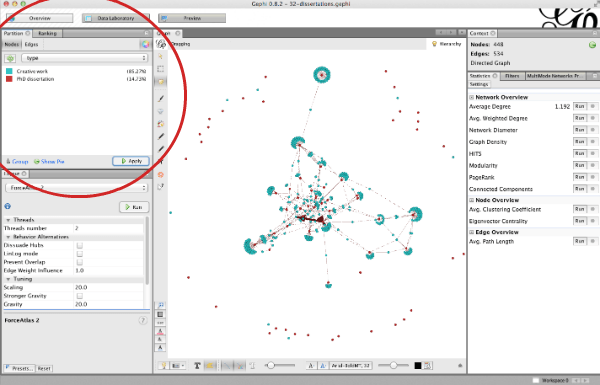
- Figure 5: Partition the network by type to clearly see which nodes are PhD dissertations and which are Creative works. In this view, Creative works are blue and PhD dissertations are red.
Next you can rank the nodes by the number of inbound links, or their in-degree. All edges in this network point from PhD dissertations to Creative works, so PhD dissertations have an in-degree of zero. All the creative works have an in-degree of at least 1, but some have far higher in-degree. If you run the “Average degree” algorithm in the Statistics window on the right of the workspace, you can see the average degree and then you will be able to view the actual degree of each individual node in the Data Laboratory (Figure 6). You can see that afternoon, a story has the most references from dissertations, 10 of 32 dissertations cite it.

You make the frequently-cited nodes appear bigger by selecting the Ranking tab instead of the Partition tab, selecting Edges and the attribute by which to rank them (In-degree) and then you click on the tiny diamond-shaped icon next to the colour wheel in the upper left of that tab so they’re sized instead of coloured differently (Figure 7). You can choose a minimum and maximum size that you think shows the variation well.

Now let’s see how this looks in Preview (Figure 8). Click the refresh button at the bottom to see your graph – and you’ll have to click refresh every time to make any changes, too. The default view gives you curved edges. It’s useful to know that in network analysis this means that the edges are directed, and you can read the direction by following the curves in a clockwise direction. So don’t use curved edges just because you think they’re pretty – or if you do, realise that people who know network analysis are going to read meaning into your pretty curves. In this graph we actually do have directed edges, so curved edge lines are appropriate.

In Figure 8, I’ve ticked the “Show Labels” box, and I’ve reduced the font size a lot. I’ve also ticked the “Shorten label” box and set the maximum length to 15 characters. I set the colour of the edges to be light grey.
It’s still quite hard to read the labels of the nodes because the labels overlap. To fix this you’ll have to go back to the Overview. can try running the ForceAtlas 2 layout algorithm again with “Prevent Overlap” ticked, or you can try the “Label Adjust” algorithm instead, or you can simply drag individual nodes around so they overlap less. You can also try running ForceAtlas 2 with increased Scaling.
One way of simplifying the graph is to filter out the nodes that are less frequently cited. You do this from the Filter tab on the right – it may be hiding behind the Statistics tab, so check the tabs at the top of this part of the workspace.

If you run the ForceAtlas 2 layout algorithm again now, you’ll see the nodes pull together in a different way. In Figure 10 you can see how the graph clusters differently without the infrequently-cited works.

Now you can turn labels on in the Overview and more or less read it. You can also use the hand icon to drag nodes slightly around so the labels don’t overlap, or just to click on an individual node and see what it connects to (Figure 11).

When you’re happy, switch to Preview again and make it pretty.

Now you can think about what the connections mean. I think the clusters correspond pretty clearly to genres of electronic literature. I can see interactive fiction, kinetic poetry, installation-based visual poetry with physical interfaces, generative narratives and poetry and in the middle, a big tangle of “classics” that are cited by a lot of different dissertations.
For more details, read the draft of my paper on this dataset for ELO2013 in Paris next month, or Scott Rettberg’s analysis of canonicity as expressed in the Electronic Literature Knowledge Base (PDF) where he uses similar visualisations of a slightly different dataset. Here’s the description of our panel, which will also include analyses of Brazilian electronic literature and of embodiment in electronic literature, using the Knowledge Base as a dataset.
In future tutorials I’ll explain how to actually get data out of the Electronic Literature Knowledge Base and into Gephi, so you can get your hands on different kinds of data to analyse. And I’ll also explain how to convert this two-mode network into a one-mode network and what that means.
Do ask if you have any questions or ideas!


bookmarks for August 27th, 2013 through August 28th, 2013 | Morgan's Log
[…] Tutorial: How to explore a network graph of electronic literature in Gephi – – (de ) […]
Resource: How to explore a network graph of electronic literature in Gephi : Digital Humanities Now
[…] View Tutorial Here […]
shan
Im looking at identifying tech trends using the patent citation network data.
Need some inputs regarding how to prepare the input file that is gephi compatible.