Oh, what the heck. This new design isn’t finished, but it’s getting there and I’m having fun with it and I’ll just fix it as I go. I’ll keep publishing the old design as old.html at least until this design stabilises, so just go there if you get too frustrated at this. I promise that this new design will soon acquire recent comments, trackbacks, nice round corners for the left column boxes, better date stamps for posts and, not least, more working links. Oh, and archives and lists of publications and such that actually match. Let me know if it looks weird in your browser!
Related
Discover more from Jill Walker Rettberg
Subscribe to get the latest posts sent to your email.
anders
What’s with the comments? I already sent you one saying about this:
Congratulations! Cool design. Way better! This look becomes you!
steve
Very sharp.
Lars
The new design works pretty well in Opera, but IE for Windows is a mess.
George
Nice!
It looks lovely in Netscape 7.1 for Win2k.
Very chaotic in IE 6 for Win2k.
Frank
Nice one Jill! I like it 🙂 If you need help working out the kinks for IE, just holler.
Collin
Very nice looking design! It looks way better, I think.
scott
I don’t see your title at the very top (on Safari). I think you need something there — a lot of unused real estate, and I’m not sure I’m crazy about the way your face sort of blurs into the whitespace. I’m also wondering if you could do some kind of short version of your blogroll that just shows the sites that have been updated and links to a longer list. Overall however it’s an excellent redesign. And it’s good to see your face.
weez
It looks like you…or at least my mental image of you.
Specifics: On the Mac, Mozilla checks out. It’s whacked on IE. (Mine is too, shrug).
Jason
I think the design concept looks great. Here’s what I see currently, with WinXP Pro, IE 6, 1024×76, and I think this is a … 17 inch monitor (my work computer). It’s sorta all over the place.
Left sidebar looks fine (as long as the blue isn’t supposed to extend down yet).
The middle content area is way to the right, leaving a ton of white space between the left sidebar and the content area (about the width of the “jill/txt” text). The jill/txt itself is cut in half horizontally (only see the top).
The right side bar floats over your content column, so much so that the content bleeds all the way underneath to the other side.
I’d send a screenshot, but I don’t have photoediting software on my work computer (*sigh*).
Jill
Oh dear. Sounds like it’s REALLY terrible in Windows explorer. So much for whamming up a new design prematurely, huh? I obviously should have checked it in Explorer but I hate using Explorer but still… It looks whacked in Explorer for Mac too. Presumably similarly whacked.
Does Explorer not understand margin-right? Huh? And what’s up with the top left image disappearing, and the title (which is absolutely placed and the first thing in the HTML) being in the wrong place? I suppose the silver lining is that if I can fix those things – and do something about the weird float thing in the publications box – the rest is OK.
Thanks for all the comments – I’ve obviously got some work ahead of me!
(and Frank, I’m emailing you 🙂
fiviecats
Yep, Foxfire gets everything right on the OS X side. IE on OS X doesn’t. IE on XP doesn’t. Yikes. (IE X doesn’t get anything but a blue block on the left. No image, or text. Your “jill/text” shows up in the middle of the first entry.)
When I was designing my wife’s webpages the biggest headache was in having to go back and forth between IE and Netscape to get everything to work properly.
Are you trying to demonstrate the notion that no good deed goes unpunished? 🙂
…
Jill
So I checked my stats and it turns out only 44.6% of people who read jill/txt use Explorer in any variant. 45% use browsers that identify themselves as Netscape, and the rest use Opera and Konquerer and others.
So half of you are seeing the new design right 🙂
HÂkon Styri
Regarding how your new design looks in IE it’s probably appropriate to label it jill’s kill bill look.
However, trying to parse or validate the code I’m postponing the billbashing until later in your testing. :o)
Jill
Goodness! I suddenly fixed almost everything!
Validating code is smart. (Yes I do tell my students that). I did mess around with lots of changes but fixing a
left:45;
making it
left:45px;
seemed to be where things straightened out. As in they ALL straightened out. How peculiar. Though certainly, my mistake, yes!
Now I just need the left column to show the image and textboxes and I’ll be set! How astonishing!
Well. That’s assuming Explorer for Windows works the same as Explorer for Mac. I’m hoping so.
Elin
Hey – it is looking better! Thanks for sharing the process – it is interesting to see things change step for step!
E.
Jason
It looks tons better.
The corners for the “who?” are still white, rather than blue (photos, too).
In my browser (winXP Pro, IE 6), your “publications” box has an odd bit of pink extending beyond the corners of the box (about 5 pixels worth of extra pink extending top to bottom on the right-hand side).
And the “jill/txt” title is still chopped in half.
But it looks like it’s really coming together.
vika
Great design, very readable! And good to know that adding “px” helps, for my own sake. (In a couple of days we’ll be designing a proto-interface for RolandHT. That is going to be fun, and I’m sure I’ll use your px tip!)
Ben the Geographer
I really like the new look. Well Done.I hope your students appriciate it too! If only I had the initiative to make my blog this nice.
Helge
What a lovely design!
HÂkon Styri
Looks much better now, and the design is quite nice.
Valid CSS helps, though you should probably consider to practice safe CSS as well. However, even valid and safe CSS may not work if the HTML or XML isn’t valid (or at least well formed).
Btw, the “jill/txt” header weirdness seems to be some trouble with the box size and text positioning. (debugging hint: play with borders and/or background colour – it makes the box model visible.)
Frank
I just send Jill a CSS file that I worked on. I’ve checked it in Mozilla, IE5, IE5.5, IE6, Opera 6 and 7 on Windows. You can check it out at: http://fragment.nl/test/jill.html and any comments welcome of course 🙂
Toril
Kjempefin side, Jill! Har du html og css validert den? Bare sÂnn for ordens skyld altsÂ….
Jill
The CSS validates but there are some errors in the HTML. Some I’ll be able to clean up, some are actually about a misformed URL I link to. I might have sorted it out by midnight tonight, which is your deadline for completing the blog redesign assignment 🙂
i1277
Nice layout!
The individual posts get a huge font size in Opera. This is because the h2 class=”title” tag isn’t properly closed, so that the rest of the text inherits the properties of that class. As you can see the closing tag uses h3 instead of h2:
<h2 class=”title”>skin deep</h3>
Eirik
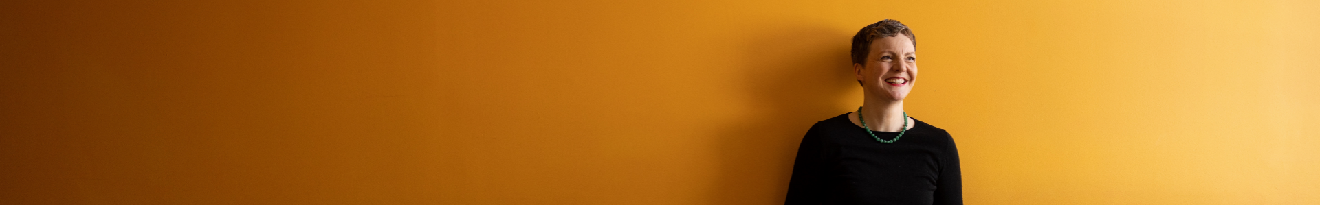
The new design is clean and tidy, but to my taste the portrait on the upper left is too big and domineering. This may be due to my mainly using 1024×768 screens, or perhaps it just comes down to plain old conservatism – I find that too much visual information on a webpage tends to interfere with my reading. What with the removal of the blogroll and the redesign of the last comment/trackback list, your blog seems less cluttered, but also less informative now than it used to be.
Jill
Thanks, i1277! Edits that forget to be complete edits tend to do that sort of thing – I’ve fixed it now!
Eirik, I’ll be leaving the image as it is for now – I need to try DIFFERENT for a while! The blogroll and lists for recent comments etc may well return. There’s a link to my Kinja digest, though, which may be more useful for some users.
We’ll see.
lisa
Wow, Jill, it’s gorgeous. (This might have something to do with the beautiful woman behind the blog!)
I’m just back after a two-month break working on a novel.
Very nice design!